
Maybe it’s the season and all the plastic bones scattered about my neighbors’ lawns, but I went a bit dark for my latest work. It’s loosely based on a photo by Penny. I thought it had an unsettling, scary look.

First I did a rough sketch and used string to outline my desired size on the design wall. Then, I laid out fabrics I wanted to consider and began pinning chunks of them to the wall. I used two fabrics I had printed by Spoonflower plus various commercial fabrics, including some I had despaired of ever using.
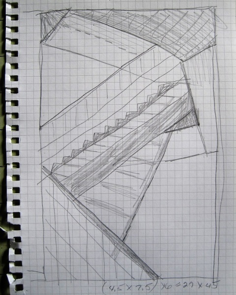
I decided to use the photo as a starting point, rather than recreate it exactly, and ended up with this. I had to get creative with some of the seam joins.

I have to decide whether to leave the upper left triangle as is, or change it to the solid bronze color fabric. All opinions are welcome.

It finished about 27 inches wide by 42 inches high. Now all it needs is quilting and a title once I resolve the upper left corner.
I am linking to Off The Wall Friday.

I shall be interested to see what you choose for the corner. My first reaction preferred the dark, as it is closer to the inspiration, but looking at it again after reading comments leads me to the bronze. It really does seem to be a matter of creating the original mood of unsettled/scary, or being optimistic or hopeful.
I’m beginning to see the choice as a personality test. Are you an optimist or pessimist? Is the glass half full or half empty?
I prefer the dark triangle. For me, it makes the composition more “serious.” I am not sure what I mean by that. Either way, you once again hit it out of the park.
Thanks for your compliment. Maybe you mean the dark triangle makes the piece more severe?
The lighter color triangle creates the illusion of height and light. Glad I could inspire you with my photo;)
I guess I have to decide whether to be an optimist or pessimist with this piece. Between you and my brother I have oodles of inspiration.
Wow, cool inspiration photo! Your piece has so much dimension and I think changing the left corner add another layer (it looks yellow on my monitor) and more depth. Great use of your Spoonflower fabrics. I’m looking forward to seeing how you quilt it.
I didn’t know what to call the fabric color as it’s kind of pickley and muddy. A friend said this piece was architectural.
I would leave it as it is. Looks like a ceiling with light coming in from above or stairs going out through ceiling.
As is is certainly truest to my source photo. Thanks for your impressions.
I like the black triangle, I think it makes it look more dramatic. It also helps my eye return to the thin strip of “fish bone” fabric running from middle left to the middle of the bottom, and then up and around again following the fish bone and “static” fabrics. I really love those fabrics as well as the big dot fabric and the one that looks like concrete on the right.
The fish bone (what a great description) is an edited photo of my deck. And I think it’s dramatic effect versus echoing of fabric in the lower right.
I’ll be the odd man out and admit I like the first version better, without the bronze triangle. Maybe I just like assymetrical. Cool piece, whichever you decide to go with!
Never worry that you’re not in lockstep with others. Your point of view is equally valid. Obviously I’m tornor I wouldn’t have asked for opinions.
I can see that your first choice of fabric follows the shading of the photo, but I love the look of the bronze corner and how it balances out the quilt. Great work on your quilt. I really like it.
Thanks for the compliment and the input.
I like your design interpretation of the photo, Joanna, and add my vote for the bronze in the upper left. It references, without duplicating, the gold in the lower right, helping to continue the movement. As to your view of the image as unsettling and scary, I see something different: the open steps can be unnerving (at least for me), there is darkness below, and we don’t see what is at the top of the stairs, but as in the photo the light increases as the eye climbs, which can be viewed as a sign of hope, an indication of even better days to come if we but have the courage to take steps, if not leaps, of faith. … and that concludes today’s philosophy essay!
I love hearing your reaction to this piece as every viewer adds something new to it.
I like the bronze triangle.
Thanks for taking the time to comment.
I like the bronze triangle
I appreciate your input.
What a cool interpretation of the photo. I love it. And definitely the bronze for the upper left. It brings the eye up (rather than cut off the top left) and balances the movement going on below.
Thanks for your kind words and your vote.